
Why technical analysis matters to every investor
Robert Kiyosaki often stresses that investors must learn the language of money the way doctors learn the language of medicine. Stock charts are a core part of that language. A chart is simply a visual record of two things: what a stock’s price has done, and how much of it has traded hands while doing it.
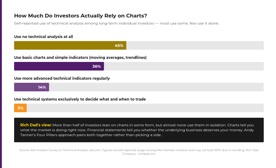
According to a long-running AAII member survey, the investing public is split on how much weight to give charts — a sizable share of individual investors say they use no technical analysis at all, while a comparable share lean on basic charts and moving averages, and a much smaller group goes deeper into advanced indicators or trades technical signals exclusively. The takeaway isn’t that one camp is right and the other wrong. It’s that most experienced investors treat charts as one input among several, not the entire decision.
That’s consistent with how Charles Schwab frames the choice between stock-picking approaches: fundamental analysis has traditionally been used for longer-term trades based on earnings and valuation, while technical analysis is used to time entries and exits around those decisions. The two methods answer different questions — fundamentals tell you what might be worth owning, and a chart helps you decide when.
The five stock chart types every investor should know
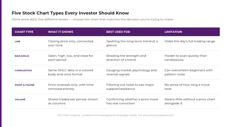
Each chart type takes the same underlying price and volume data and presents it differently. Picking the right one depends on what question you’re trying to answer.
1. Line charts: The simple start
A line chart plots a stock’s closing price at regular intervals — daily, weekly, or monthly — and connects the dots into a single line. It’s the simplest way to see the big picture.
As both Robert and Andy often teach, simplicity leads to clarity. A line chart strips away the noise of intraday swings and shows you the trend that matters: is this stock generally going up, going down, or going nowhere? That’s often the first question worth answering before digging into anything more detailed.
2. Bar charts: A step further
A bar chart adds three more data points to each period: the opening price, the closing price, and the full trading range (high to low). The vertical line shows the range; small horizontal notches mark where the period opened and closed.
Rich dad has said that to understand a market, you have to understand its mood. A bar chart captures that mood directly — long bars suggest a volatile, emotional session, while short bars suggest quiet consolidation. Traders also use bar charts for pattern-based technical analysis, looking for recurring shapes that have historically preceded reversals or continuations.
3. Candlestick charts: Reading the market’s mood
Candlestick charts show the same open, high, low, and close data as a bar chart, but in a format that’s easier to scan at a glance. Each “candle” has a body (the range between open and close) and thin wicks above and below it (the day’s full high and low). The body is typically shaded one color when the close is higher than the open, and another when it’s lower.
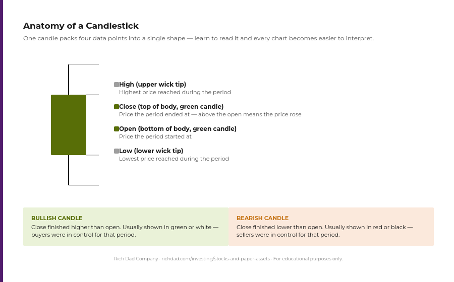
Candlestick charts originated with 18th-century Japanese rice traders and were popularized in the West by Steve Nison’s 1991 book on the subject — but the underlying logic hasn’t changed. Each candle is a small story about who won the tug-of-war between buyers and sellers during that period. Stack enough of them together and patterns emerge that traders use to anticipate reversals, which lines up with Andy’s emphasis on using technical analysis as a forecasting tool, taught in more depth in his course, Zero to Cash Flow. For a deeper dive into the dozens of recognizable candlestick formations, see the Rich Dad Beginner’s Guide to Candlestick Chart Patterns.
4. Point and figure charts: Ignoring the noise
Point and figure (P&F) charts are unusual: they remove time from the equation entirely. Instead of plotting price against days or weeks, they record price movement in columns of X’s (rising prices) and O’s (falling prices), and only when the price moves by a meaningful amount.
This filtering approach lines up with Robert’s philosophy of ignoring the herd’s minor noise. By plotting only significant price changes, point and figure charts make major support and resistance levels easier to spot, since they’re not buried under the daily back-and-forth that dominates other chart types.
5. Volume charts: Combining price and activity
A volume chart shows how many shares traded during each period, almost always displayed as columns beneath a price chart rather than on its own. Volume adds a dimension price alone can’t: conviction.
A sudden spike in volume on a price move — up or down — suggests real investor sentiment behind it, not just a handful of trades nudging the price around. Both Robert and Andy encourage understanding the herd rather than following it blindly. If a fundamentally strong company sees a price drop on unusually high selling volume, that can be a signal that panic, not fundamentals, is driving the move — which is often when disciplined, long-term investors look to buy. Combining price action with volume gives a far more complete read on what’s actually happening in a stock.
The technical indicators worth knowing first
Beyond the five chart types, most chart readers eventually layer on a small set of recurring tools rather than trying to master all of them at once.
| Signal | What it tells you |
|---|---|
| Trend (moving averages) | Is the average price over recent weeks or months rising, falling, or flat? Defines the dominant direction. |
| Support & resistance | Price levels where a stock has repeatedly stopped falling (support) or stopped rising (resistance). |
| Momentum (RSI, MACD) | Is the move accelerating, slowing, or running out of steam? Often flags reversals before price confirms them. |
| Volume confirmation | Is trading activity backing up the price move, or is the move happening on thin, unconvincing volume? |
A moving average smooths out short-term noise to reveal the underlying trend. Support and resistance mark price levels where a stock has repeatedly reversed course, giving traders rough boundaries to watch. Momentum indicators like the Relative Strength Index (RSI) and MACD attempt to flag when a move is losing steam before the price itself confirms it. And volume, as covered above, tells you whether the move has real participation behind it. Most professional chart readers build their process around some combination of these four ideas rather than chasing every available indicator at once.
Technical analysis vs. fundamental analysis: Why successful investors use both
It’s tempting to treat technical and fundamental analysis as competing camps, but most experienced investors don’t pick a side.
Fundamental analysis examines a company’s financial health — earnings, revenue, debt, competitive position, and broader economic conditions — to estimate what a business is actually worth. Technical analysis sets that aside and studies the chart itself, on the theory that the price already reflects everything the market currently knows. Neither approach has a monopoly on being right. A great company can have a chart in a multi-year downtrend, and a mediocre company’s stock can spike on hype with no fundamentals to support it.
As Robert says, investing is not a science, but an art. Stock charts provide valuable insight into market sentiment, but they shouldn’t be used in isolation. This is the foundation of Andy’s Four Pillars of Investing framework: fundamental analysis to find a company worth owning, technical analysis to time the trade, cash flow strategies like covered calls to generate income along the way, and risk management to protect capital if the chart turns against you. Used together, these four disciplines give an investor a far more complete picture than any single method on its own — which echoes the same multi-criteria approach Robert teaches for evaluating any asset class, from real estate to business ownership.
How to start reading charts as a beginner
Getting comfortable with technical analysis doesn’t require mastering every indicator on day one. A simple starting sequence: pull up a line chart of a stock to see its overall trend, switch to a candlestick view to study recent price action in more detail, layer on a moving average to confirm the trend, and check the volume chart underneath to see whether recent moves had real conviction behind them. From there, fundamentals — the kind covered in Rich Dad’s Stocks and Paper Assets resources — round out the picture before any money changes hands.
Free charting tools from most major brokerages and platforms like TradingView or StockCharts make all five chart types accessible without any cost, which means the only real barrier to learning this skill is time and repetition. Pull up a handful of charts you’re already familiar with — companies you use as a customer, stocks in your own portfolio — and start practicing the basics covered here.
The art and science of reading stock charts
Understanding stock market charts is a core piece of becoming a financially literate investor. Each chart type offers a different lens on the same underlying story: what a stock’s price has done, and how convincingly the market backed that move. Line charts reveal the big-picture trend, bar and candlestick charts reveal mood and momentum, point and figure charts cut through the noise, and volume charts confirm whether a move has real conviction behind it.
But charts are one tool, not the whole toolbox. Pairing technical analysis with fundamental analysis, sound cash flow strategy, and disciplined risk management is what separates an investor with a complete financial education from someone simply staring at squiggly lines. With continuous learning and a holistic approach, reading charts becomes less about predicting the future and more about making informed decisions that fit your own financial goals.
FAQs
Technical analysis is the practice of studying a security’s price and trading volume on a chart to identify trends and patterns, with the goal of making more informed buy and sell decisions. It’s typically contrasted with fundamental analysis, which studies a company’s financial statements instead.
Line charts are the simplest starting point because they show only the closing price over time, making the overall trend easy to spot without the added detail of bar or candlestick charts.
Neither is inherently better — they answer different questions. Fundamental analysis helps determine whether a company is worth owning long-term; technical analysis helps with timing entries and exits. Many experienced investors, including Andy Tanner, use both together.
No. Most brokerage platforms, along with free tools like TradingView and StockCharts, offer all five chart types covered here — line, bar, candlestick, point and figure, and volume — at no cost.
The five chart types and four core signals covered in this guide can be understood in an afternoon. Becoming comfortable reading them in real time, on real stocks, takes ongoing practice — the same way any new financial skill does.