What Is a Candlestick Chart?
The candlestick chart is the most widely used price chart in technical investing, and for good reason: it packs more information into a single visual than a line chart or bar chart while remaining easy to read at a glance. Each candlestick represents one unit of time — a day, an hour, a week, whatever timeframe an investor has selected — and tells the same basic story every time.
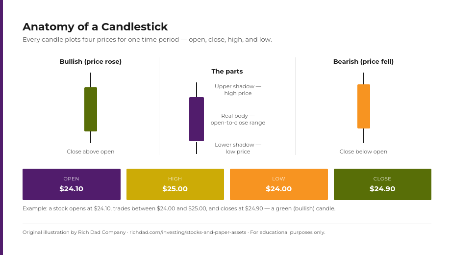
The real body is the thick rectangular portion of the candle. It marks the distance between the stock’s opening price and its closing price for that period. A green (or hollow) body means the stock closed higher than it opened. A red (or filled) body means it closed lower. Above and below the real body are the shadows, sometimes called wicks. These thin lines mark the highest and lowest prices the stock touched during the period, even if the price didn’t stay there.
Put together, a single candlestick tells an investor four things at once: where the price started, where it ended, and how far it wandered above and below that range along the way. String enough candlesticks together and a chart starts to read less like raw data and more like a narrative of who was winning the argument between buyers and sellers.
Why Candlestick Chart Patterns Matter for Investors
Hedge funds and institutional trading desks have long used candlestick chart patterns as a building block for faster, systematic trading decisions, and that same visual language is available to any individual investor willing to learn it. Reading candlestick patterns won’t replace fundamental research into a company’s financial health, but it adds a second lens: instead of only asking whether a business is a good one, an investor can also ask what the current price action suggests about near-term buyer and seller sentiment.
That said, the research on candlestick patterns as a standalone trading system is mixed at best — academic studies of historical returns have generally found that raw pattern signals, used alone, don’t reliably beat the market. That’s not a reason to ignore them; it’s a reason to use them the way Rich Dad teaches every technical tool: as one input that gets weighed against trend, volume, and price levels, never as a system on its own. A doji candle, with its small body and roughly equal upper and lower shadows, is a good example — it signals indecision in the market, not a coin flip an investor should trade blindly.
Bullish Candlestick Chart Patterns to Know
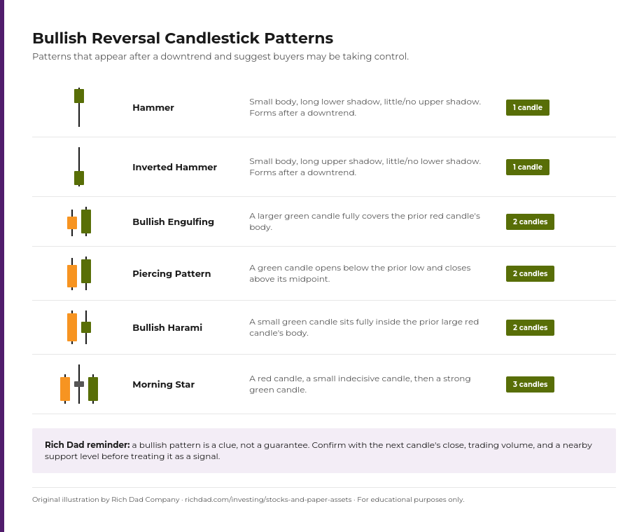
Bullish patterns tend to appear after a downtrend and suggest buyers may be stepping in to take control from sellers. They range from single-candle signals to three-candle formations, and each carries more weight the more clearly it appears at a logical turning point rather than in the middle of a random range.
Hammer
The hammer forms after a stock has been falling. It has a small real body near the top of its range and a long lower shadow, with little or no upper shadow — a shape that suggests sellers pushed the price down during the period, but buyers fought back hard enough to close it near where it opened.
Inverted Hammer
This pattern looks like a hammer flipped upside down: a small body near the bottom of the range with a long upper shadow. It also appears after a downtrend and suggests buyers tested higher prices, even if they couldn’t hold the close there yet.
Bullish Engulfing
A two-candle pattern where a smaller red candle is immediately followed by a larger green candle whose body completely covers, or “engulfs,” the body of the candle before it. This is one of the more reliable reversal signals because it shows a decisive shift in control within a single session.
Piercing Pattern
Also a two-candle setup: the first candle is red and continues the downtrend, then the second candle opens below the prior low but rallies to close above the midpoint of the first candle’s body. The gap-down open followed by a strong recovery suggests buying pressure is building.
Bullish Harami
The mirror image of the piercing pattern’s setup: a small green candle forms entirely within the body of the prior, larger red candle. The shrinking range signals that selling momentum is fading, even before buyers have fully taken over.
Morning Star
A three-candle pattern: a long red candle, followed by a small-bodied candle that gaps down and shows indecision, followed by a strong green candle that closes well into the first candle’s body. It’s one of the more visually distinctive reversal patterns because the “star” in the middle marks the exact moment sentiment turned.
Bearish Candlestick Chart Patterns to Know
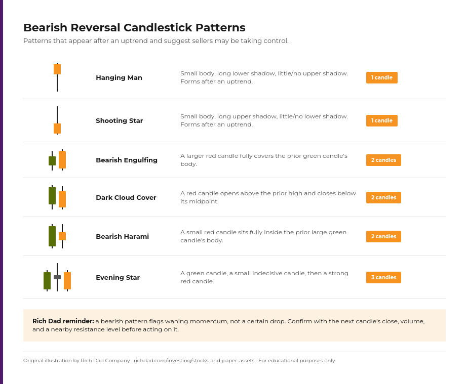
Bearish patterns are the mirror image of bullish ones. They tend to appear after an uptrend and suggest sellers may be gaining the upper hand.
Hanging Man
This pattern has the same shape as the hammer — a small body with a long lower shadow — but it appears after an uptrend instead of a downtrend. The long lower shadow shows sellers pushed the price down sharply during the session before buyers recovered it, a warning sign that the uptrend’s momentum may be cracking.
Shooting Star
The bearish twin of the inverted hammer: a small body near the bottom of the range with a long upper shadow, forming after an uptrend. It suggests buyers pushed prices higher during the period but lost control by the close.
Bearish Engulfing
A smaller green candle is followed by a larger red candle that completely covers its body. Like its bullish counterpart, this pattern reflects a decisive session-over-session shift in control, this time from buyers to sellers.
Dark Cloud Cover
The first candle is green and continues the uptrend. The second candle opens above the prior candle’s high but closes below the midpoint of its body, suggesting sellers overwhelmed an initially strong open.
Bearish Harami
A small red candle forms entirely inside the body of the prior, larger green candle, signaling that buying momentum is losing steam even before a clear reversal has taken hold.
Evening Star
The bearish mirror of the morning star: a strong green candle, a small indecisive candle that gaps up, and then a strong red candle that closes well into the first candle’s body. It’s a three-candle pattern that marks a clear pivot from buying to selling pressure.
Neutral Patterns: The Doji and the Marubozu
Not every candlestick pattern points a direction. The doji has a small body or no visible body at all, with the open and close prices virtually equal, and shadows extending roughly the same distance above and below. It looks like a cross or plus sign, and it represents pure indecision — neither buyers nor sellers won the period. A doji that appears after a strong trend is often watched closely, since it can be an early hint that the trend is losing energy, but on its own it says only that the market paused to think.
The marubozu is the doji’s opposite: a long real body with no shadows at all, meaning the stock opened at its low (or high) and closed at its high (or low) with no pullback in between. A bullish marubozu, with a long green body, shows buyers in complete control from open to close. A bearish marubozu, with a long red body, shows the same for sellers. Because it has no shadow to soften the story, the marubozu is usually read as a strong continuation signal rather than a reversal one.
How to Read Candlestick Patterns Like a Story
Andy Tanner, the Rich Dad Advisor who teaches paper asset investing, likes to compare a candlestick chart to the plot of a sitcom romance: it follows a familiar arc if an investor learns to recognize the beats. Interest builds, momentum peaks, doubt creeps in, and eventually the relationship — or the trend — ends. A stock’s candlestick chart often tells the same kind of story. The market gets excited about a company and the price climbs. Then momentum stalls: the price stops climbing but hasn’t turned down yet, often showing up as dojis or small-bodied candles. Finally, sentiment turns, and a bearish reversal pattern marks the moment the market falls out of love with the stock.
Learning to read that story, candle by candle, is less about memorizing forty pattern names and more about understanding what each candle reveals about the ongoing negotiation between buyers and sellers. A trader who can read that negotiation in real time has a genuine edge over one who is only looking at where the price is right now.
Candlestick Patterns Are Signals, Not Guarantees
This is the point Rich Dad returns to on every technical tool, and it applies especially to candlestick chart patterns: a pattern is an alert, not a prediction. The same hammer that marks a genuine bottom nine times can fail to hold on the tenth. That’s not a flaw in the tool — it’s a reminder that candlestick patterns work best as one input inside a complete framework, the same way Rich Dad’s investment filter treats any single data point as a question worth investigating rather than an answer to act on alone.
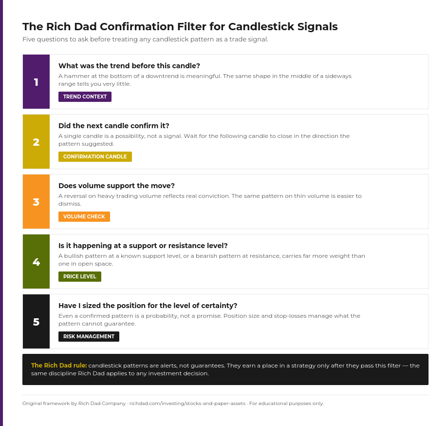
Before treating any candlestick pattern as an actionable signal, it’s worth running it through a short filter: What was the broader trend leading into this candle? Did the following candle confirm the move, or did the pattern fail to follow through? Was trading volume unusually high, suggesting real conviction behind the move? And is the pattern forming at a meaningful support or resistance level, rather than in the middle of an unremarkable range? A pattern that clears all four checks is a far stronger signal than the same shape appearing in isolation.
Getting Started with Candlestick Chart Patterns
The fastest way to get comfortable with candlestick chart patterns is repetition in a low-stakes setting. Most online brokerages offer free charting tools with a paper trading or simulated account, which lets a new investor practice spotting hammers, engulfing patterns, and dojis on real historical data without risking real money. Start with the handful of patterns covered here — they cover the large majority of what shows up on a typical chart — before branching out into rarer, more complex formations.
Candlestick reading is one piece of a larger skill set. Pairing it with fundamental analysis of the business itself and a clear-eyed risk management plan is what separates an investor with a genuine edge from someone chasing shapes on a screen. Rich Dad’s approach to paper assets has always been to build that complete toolkit rather than a single trick, because markets change and any one signal, on its own, eventually stops working.
FAQs
No single candlestick pattern is reliable on its own. Multi-candle patterns like the bullish and bearish engulfing patterns tend to be watched more closely because they require a decisive shift in control across two full trading sessions, but every pattern should be confirmed with trend, volume, and price level before being treated as a signal.
A beginner doesn’t need to memorize all 40-plus recognized candlestick patterns. Starting with the handful covered in this guide — hammer, inverted hammer, engulfing, harami, doji, and the three-candle star patterns — covers most of what appears on a typical stock chart.
Yes. Candlestick charts and the patterns that form on them are used across asset classes, including cryptocurrency, forex, and commodities, because the same open-high-low-close data is available for any asset that trades continuously.
Both display the open, high, low, and close for a period, but a candlestick chart uses a colored, wide real body to make the open-to-close move easy to spot at a glance, while a bar chart uses small tick marks on either side of a vertical line. Most traders find candlestick charts faster to read visually.
No. Candlestick patterns are probability-based alerts drawn from historical price behavior, not guarantees. Rich Dad teaches investors to treat every pattern as one data point inside a broader strategy that includes trend analysis, volume, support and resistance, and sound risk management.